I turned our Figma library into code, then wrote the rules that let product people build internal tools without waiting for a designer.
Design systemsDesign engineeringFront endFigmaReactRadix UITanStack TableMCPAgent SkillsClaude Code15 min read
Outcome
Design goes straight to code: consistent products and rapid prototypes ship without a Figma step
Product managers ship small internal tools fast, and they look like the rest of the product
I built the Warehouse Center on the system, and it became one of the products the operation runs on
In this article22
The Figma system · Into code · Rules for agents · Epilogue
Loading case study
TL;DR
2024, in Figma. I designed Tagaddod's design system: tokens that work in English and Arabic, and components built from the smallest part up to the table.
2025, in code. I built the coded library myself with a coding agent, on headless components dressed in our designs, and handed it to front end.
2025 to 2026, for everyone. Product people were building their own tools with AI, and no two looked alike. I wrote the house rules an agent needs to build our way, put an MCP server in front of them, and sat with people while they built.
Role
Product Designer & Design Engineer
Duration
The middle of 2024 to 2026, alongside my design work
Scope
Figma tokens and components, React component library, Agent skills and screen guide, MCP server, Documentation, training and rollout
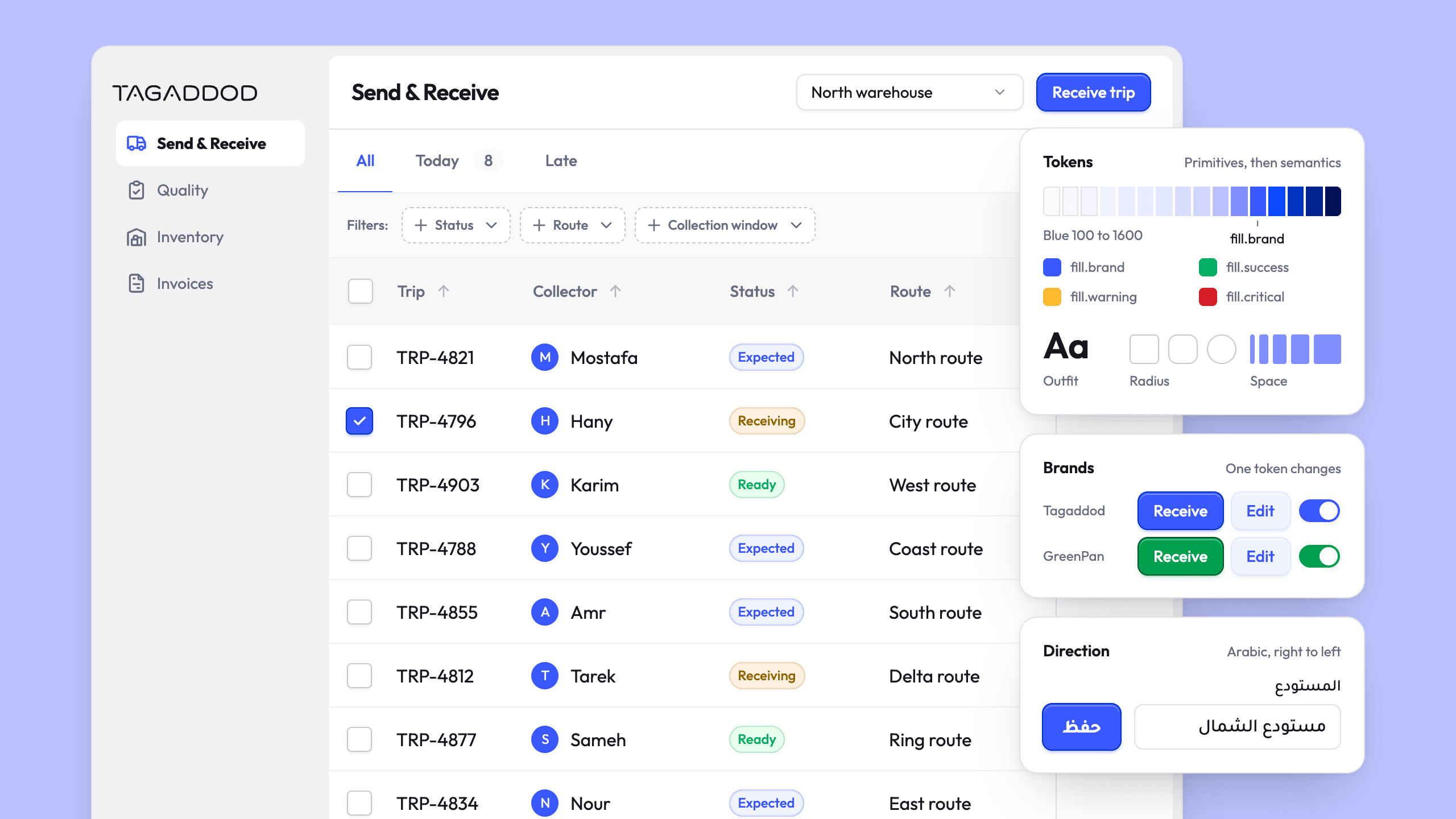
The library's tokens, its buttons and badges, and a trips screen built from its parts. Only the terminal is illustrated.
Chapter 01 · 2024
The handoff
Why did every screen come out almost right?
When I joined Tagaddod, the company had one product designer, and I made it
two. Between us sat apps for customers and for the collectors in the field, a
spread of web forms, and a growing number of internal systems. Every one of them
was designed with care in Figma.
They came out of development looking similar, with the spacing a little off and
a button that was almost ours. Nobody was doing bad work. Front end was
rebuilding each design by eye, screen by screen, with no shared parts to start
from.
In Figma
In production
An illustration. None of these differences would fail a review on its own, which is how they reached every product.
A deal with front end
The fix we agreed on was easy to say. I would design the system once, properly,
as a library. Front end would implement it once, as components. After that,
nobody would rebuild a button by eye again, because every product would start
from the same parts.
That put the weight on the library. It had to be exact enough that an engineer
could build from it without guessing, and complete enough that a designer never
needed to step outside it.
The deal, drawn: the library on the drafting table it was designed on, carried across once to front end's rack, which is pegged out because its components were not yet built, and the products it was for, an app for customers, an app for the collectors in the field, a web form and an internal system, every one of them to start from the same parts.
onceAs a libraryAs componentsEvery product would start from the same parts
In 2024 the library was ready in Figma and the components were still a plan.
Scoring set the build order
Before designing anything new, I took stock. I went through the products and
listed the components they used: which ones were being rebuilt a little
differently on every screen, and which ones had been made by hand for a single
place.
Then I scored each one on three things: how easy it would be to build, how often
it was used, and how much it shaped the experience. The scores set the order, so
the components that touched the most screens and cost the least to get right
came first.
Colour you can predict
Then colour. Picking steps by eye in HSL gives uneven ramps, because HSL's
numbers do not follow how people see brightness: a yellow and a blue at the same
lightness look nothing alike. So we built the palette on HSLuv, a human-friendly
version of HSL that sits on a perceptually uniform colour space, the same
approach Shopify's Polaris uses for its palette.
In HSLuv, two colours with the same lightness look equally bright. Every ramp
could step the same way across hues, so we could predict how a step would
contrast without checking colours one at a time.
HSL
The bars are how light each colour really looks
56
97
88
91
38
62
HSLuv
Every bar matches what was asked for
60
60
60
60
60
60
Drag the lightness. In HSL the six colours drift apart in how light they look; in HSLuv they hold the number you asked for.
Tokens before components
With the palette settled, I set up the tokens in the W3C design tokens format:
primitives first, then semantics. Primitive tokens hold the raw values, and
semantic tokens give those values a job. A component never asks for a
particular blue; it asks for the brand fill, or the border of a quiet section,
or the text that sits on a warning.
Expected tripOperational details protectedReadyView routeArrives on the inline edgeView trip
fill /brand-secondary, set by the brand tier
text /link, set by the brand tier
surface /primary
fill /success-secondary
border /secondary
fill /brand, set by the brand tier
text /primary
text /secondary
text /on-fill
Each part of the card, labelled with the token it uses. The fill and the link are blue because the brand tier sets them. In the token file they are near-black.
The same split carried type and spacing, and from the first day it carried
language. Arabic and English do not behave the same way on a page. The same
weight reads lighter in Arabic, and a line height that is comfortable in English
clips it. So the tokens had to answer for both before any screen used them.
Each tier may touch one thing
A structure like this stays small only if each tier is allowed one job and
refused the rest.
The core tier holds the raw values and belongs to nobody. Every step of every
ramp, every size and every radius lives here, named for what it is. A brand may
reach in, but rarely, and only when its own green is a different green.
The semantic tier is brand-neutral on purpose. The brand fill is near-black at
this tier and only becomes a colour one tier down. That is why a second brand
could arrive later without a rewrite.
The locale tier swaps the family and the weight ladder, and touches no colour.
One token, the regular weight, resolves to 400 in English and 500 in Arabic,
because Tajawal reads lighter at the same nominal number and its ladder has fewer
usable steps.
The direction tier changes no value at all. The properties are logical, so the
only thing that moves is the side they resolve to.
Two brands, two locales and two directions make eight versions of every screen,
and almost nothing is duplicated to get there.
The figure below runs on the tokens as they are today, so flip its switches to
see which tiers change. The brand switch came later, when the tokens moved into
code.
Nothing is overridden. Every value on the card resolves through the defaults.
01
Core
:root
blue
1200 #3959fe
green
gray
1600 #16161d
space
100200300400600800
radius
100200300400
02
Semantic
:root
The semantic tokens the card resolves: what each one resolves to, and what it is for.
Token
Resolves to
Its job
fill.brand
gray.1600
Main actions, like primary buttons.
fill.brand-secondary
gray.500
Brand elements with a secondary level of prominence.
text.link
gray.1600
Text links.
text.primary
gray.1600
Body text and headings.
text.secondary
gray.1200
Descriptions or helper text.
fill.success-secondary
green.200
Success, on a smaller surface, with secondary prominence.
border.secondary
gray.700
Differentiates a section or card placed on a surface.
No brand colour is set here, so fill.brand stays near-black until the brand tier sets it.
03
Brand
[data-theme="tagaddod"]
Tagaddodrestates 19 colour tokens
fill.brandblue.1200
text.linkblue.1200
fill.brand-secondaryblue.400
GreenPanoverrides 4 colour tokens and moves the core primitive green.1200 itself, from #007d44 to #009f4d
fill.brandgreen.1200
text.linknot overridden
fill.brand-secondarynot overridden
04
Locale
[lang="en"]
Each face’s weight ladder: one word at every weight role.
Face
regular
medium
semibold
bold
Outfit
Trip400
Trip500
Trip600
Trip700
Tajawal
رحلة500
رحلة700
رحلة700
رحلة700
font.weight.regular is 400 in Outfit and 500 in Tajawal, and Tajawal’s top three weights all land on 700.
05
Direction
[dir="ltr"]
ltr
startpadding-inline-start: 1rem·text-align: start
rtl
startpadding-inline-start: 1rem·text-align: start
Both rows carry the same two declarations. Only the side they land on changes.
Everything on the card is one of the tokens above, resolved.
From the smallest part to the table
Then the components, in the order they depend on each other. The smallest parts
came first: a button, a checkbox, a badge. Then the controls those parts make
together, like a select or pagination. Last, the component that leans on nearly
everything before it: the table, with its search, filters, sortable columns and
status badges.
The components raised in the order they depend on each other, like the courses of a pyramid. The smallest parts make the bottom course: a button, a checkbox and a badge among plain stones. The controls those parts make together, a select and pagination, are the course on top of them. The table, with its search, filters, sortable columns and status badges, has just been hauled up the ramp onto the top, last.
in the order they depend on each otherThe smallest partsThe controls those parts make togetherThe table
Each course rests on the one below it, which is why the table came last.
Every component got its own documentation in the library: its states, its specs,
and how it should be used. By the time it was code, the library was grouped by
what each part does.
The library drawn as a shelving unit, with a book for every component. The tokens are the plinth it stands on. Above them, three bays of two shelves: utilities, navigation and actions, and forms along the bottom shelf, then display, overlays, and layout and shell along the top one. The parts the article names stand face out.
the libraryTokensUtilitiesNavigation & actionsFormsDisplayOverlaysLayout & shell
Tokens
Raw values, what they mean, and what changes on top
Core
Semantic
Extras
Brands
Locales and directions
Utilities
Quiet helpers
AspectRatio
ScrollArea
Separator
Navigation & actions
What people press
Button
Tabs
Pagination
UserMenu
Forms
What people fill in
TextInput
Textarea
Select
Checkbox
RadioButton
Switch
DatePicker
Calendar
Number
RangeSlider
Display
What people read
Badge
Avatar
Card
Logo
Table
Overlays
What opens on top
Modal
Drawer
Popover
Tooltip
Listbox
Toasts
Layout & shell
Where a whole screen sits
Page
Navigation
ContentPanel
ContentLayout
The finished library, grouped the way its documentation groups it.
The code stopped at two components
Front end started with the button, then the text input. Both took longer than
anyone had planned. Meanwhile the roadmap kept arriving, and the product managers
had to decide where the engineer's time went. They moved it to other work, the
way a long-term fix usually loses to this quarter's features.
The library survived in Figma. Both of us designed with it every day, and it
kept our designs consistent with each other. In code, nothing changed. The
products went back to looking similar.
The same drawing at the end of the chapter, with everything in the same place. In Figma, the library is still whole on the drafting table. In code, only the button and the text input stand built on the rack, and the rest is still pegged out. Where the library was carried across, the roadmap's crates arrive on a sledge, with the crew busy moving them, and the products are marked where they went back to looking similar.
the roadmapIn FigmaIn codeThe button, then the text inputThe products went back to looking similar
The same drawing at the end of the chapter. Two components got built before the roadmap took the engineer's time.
Chapter 02 · 2025
The second try
Could a coding agent put the code in a designer's hands?
Then coding agents became good enough to take seriously.
I was not starting from zero. I had written HTML, CSS and JavaScript, a little
React, and I knew my way around Git and a build setup. But I did not have the
nerve to start a system that size from nothing, on my own, next to a full design
job. A component library is the kind of project that looks finished long before
it is.
A coding agent made starting cheap enough that I stopped asking whether I could.
Borrowing what was already solved
Before writing anything, I went looking for what I should not build, and found
headless components: libraries that solve behaviour and accessibility (focus,
keyboard control, what a screen reader hears) and leave every pixel to you.
That split suited me. Radix covered most of the library, and where it had
nothing, other libraries stepped in, like TanStack Table for the table. That
left the part I knew best: making each one look and behave like the component
we had already designed, state by state.
On the left, Radix parts with only the browser's defaults, each outlined to show where it sits. On the right, the same parts as the library ships them. The Radix logo is from the project's public repository.
Decision
Borrow the behaviour, own the look
Chose
Build on headless components, Radix first and libraries like TanStack Table where Radix had nothing, and restyle each one to the Figma library, state by state.
Trade-off
The library depends on primitives I do not control, and a component can only behave in the ways its primitive allows.
Describing a design to something that cannot see it
The hard part was the handoff again. This time the one receiving it was an
agent.
Figma had no official MCP server yet. A community one existed, but too much of
the design got lost on the way through it. So every component started as
writing. Every space was described in relative units, so it would scale. Every
state was named: hover, pressed, focus, disabled, loading, error. Every place
Arabic behaves differently was spelled out. The agent could not see the design,
so the description had to be the design.
When a component came out wrong, it was usually a decision I had not written
down.
A design on a drafting table reaching an agent, a screen on a desk, two ways. Through a community MCP server, drawn as a pipe with one joint parted, bits of the design fall out on the way. As writing, a sheet stood by the desk spells out relative units, the states hover, pressed, focus, disabled, loading and error, and every place Arabic behaves differently, while the next page is carried over. What the agent builds from it still has one small gap marked, because the description had to be the design.
the description had to be the designLost on the way through itEvery component started as writingRelative unitsHover, pressed, focus, disabled, loading, errorEvery place Arabic behaves differently
Two ways the design reached the agent. The written one carried more, and still had gaps wherever a decision was never written down.
A second brand did not need a second library
The tokens moved into code alongside the components, and once there they picked
up something the Figma file had never carried: a second brand, GreenPan, with a
green of its own.
The obvious answer was a copy: duplicate the library, swap the palette, maintain
two. Every fix after that would have to be made twice, which is what the
brand-neutral tier had been built to avoid.
A brand overrides only the tokens it disagrees with, and everything else falls
through to the value underneath. Tagaddod restates nineteen colour tokens.
GreenPan overrides four, and reaches once into the core tier to move its green.
Nothing else in either brand is stated twice.
There is a catch. Where a brand overrides nothing, it inherits a decision it
never made. Flip the brand switch on the token figure in the first chapter and
GreenPan's link and icon tile stay grey, because nothing in its tier reaches
them. The system is doing what it was built to do, and it takes a person looking
at the screen to see that grey is wrong.
Decision
One library for both brands
Chose
Let a brand override only the semantic tokens it disagrees with, and fall through to the neutral value everywhere else.
Trade-off
Whatever a brand leaves alone falls back to the neutral value, so someone has to check each brand's screens.
Components that passed alone fought when nested
Each component passed on its own. The trouble started when they met.
A drawer slides in over a page. From inside the drawer, someone opens a modal.
Inside the modal, a select opens its menu. Each had been tested alone, and
together they fought over the top of the screen: menus opening behind the
modal, popovers disappearing under the drawer.
Recreated with the library's drawer, modal and select, with the menu put back on the one layer every overlay shared before the fix.
The same screen today. The select knows it was opened inside a modal and puts its menu above it.
Patching each case would have meant patching it again in every product.
Instead, the overlays learned to notice when they are nested and to rise above
whatever opened them, and the order they stack in became tokens.
New work adopted it, existing products did not
I built a few small things with the library to find what was missing before
anyone else did, then handed it over to front end. It was partly adopted: new
work started from the real components, while the products that already existed
stayed as they were.
The shipped components at their real sizes.
With the real components in hand, I found I was prototyping faster in code than I
ever had in Figma.
Chapter 03 · 2025 to 2026
The intern
How do you teach an agent taste?
I was not the only one who had noticed what an agent could build. Product people
across the company had started building tools for their own problems with AI. It
was useful work, and there was more of it every month.
It also looked like whatever the agent happened to produce that day. The drift
from the first chapter was back, and this time it ran from a prompt straight to
a product, with nobody in between.
From Figma to code
Screen by screen, by eye
nobody in between
From a prompt straight to a product
Whatever the agent made that day
In the first chapter, front end at least checked the result against a design. Here there was no design to check it against.
So I set a goal bigger than a component library. Anyone in the company who is
not a heavy developer should be able to build something close to what a designer
would make, without waiting for one.
Given the whole repository, the agent still guessed
Back then there was no easy way to plug a design system into an agent, and
nothing like Claude Design existed. The only way was to hand the agent the
repository and tell it to design with it.
It read everything and decided nothing well. It imported components that did not
exist, invented props that sounded right, and picked a blue close enough to pass
a quick look.
The same request, first from an agent handed the repository, then from one that asks the server what is true.
House rules for a very fast intern
I started to think of the agent as an intern who has read everything and knows
none of the house rules. An intern like that needs the rules written down.
So I stopped trying to write better prompts and started narrowing the decisions
the agent is allowed to make. The first layer is how each component is meant to
be used, with the do's and don'ts a designer carries around in their head:
Never add a component to the shared library because one screen wanted it. Build it in the product.
No literal values. Every colour, space, radius and duration is a token.
Right to left is part of done, not a flip at the end.
Navigation holds pages with their own address. Never filters, records or buttons.
Never set a z-index. Nested overlays already know their place.
That last rule is the drawer from the second chapter, written the way you would
write it for an intern:
Critical rules for AI agentsCLAUDE.md
❌ NEVER manually set z-index values or style props.❌ NEVER calculate z-index in your code❌ NEVER worry about nesting depth or stacking contexts✅ ALWAYS use components as documented: they handle nesting automatically✅ TRUST the system: any combination of overlays will layer correctly
The second layer is a ladder, the order the agent tries things in. When someone
asks for something, the agent looks in the library first, from the smallest
component up to the largest. If something fits, it uses it. If existing parts
can be combined to do the job, it composes them. Only when the library has
nothing does it look outside, for a headless or ready-made component, and even
then it dresses the result in our tokens and keeps it inside the product until
it earns a place in the library.
Two requests to the same agent, replayed from a script of the server's real answers.
Around those two layers sat the guides: one for building right to left, and one
for making a screen look like a designer laid it out.
Where things go had to be written down too
Rules about components were still not enough. An agent could use the table, the
tabs and the cards correctly and still arrange them into a screen no designer
would ship. Knowing that a table exists does not tell anyone where its
filters go, which panel owns the scroll, or when a list should sit beside the
record it opens instead of covering it.
I wrote down how we make layout decisions. Our products run on nested
navigation: a rail of sections, and beside it a panel of pages whenever a
section has them. The work itself happens in panels, and
several can be open side by side. The skills apply that structure to every new
screen unless the person building asks for something else.
Those defaults came from a product I had built, the warehouse app further down
this page. The screen guide says so itself: it encodes that product's visual
taste.
Two tiers of navigation and a table, all from the library.
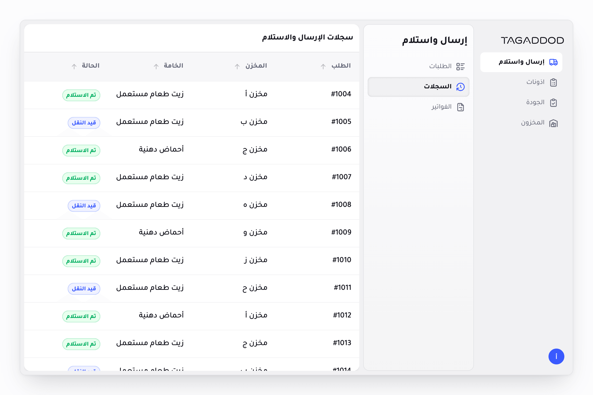
The same screen in Arabic, from the same code, running right to left.
Decision
Our layout by default
Chose
Put every new screen in our navigation and panel structure unless the person building asks otherwise.
Trade-off
A request that needs another shape has to say so, or the agent pulls it back into ours.
Everything went behind one door
All of this needed a single entrance, or it would depend on everyone remembering
which document to paste into which conversation. That entrance became an MCP
server.
The server is read-only. It answers what is true before the agent starts
guessing: which components exist, what their props are, what a token
resolves to. It also routes the request. Ask for a screen, and it points the
agent at the screen guide before anything else. Ask for a single component, and
it checks the library first and hands over the ladder when nothing fits. The
skills work through the same door: the screen assembly skill reads the guide,
picks the closest known pattern, and hands off to the skills for navigation, the
page shell, the panels and motion.
The request
Build a receiving screen
The MCP server
Routed by what was asked for.
The screen guide, before anything elseget_design_guide
How our screens are laid out: navigation, panels, and what owns the scroll.
The closest known pattern
The screen assembly skill reads the guide and picks the pattern nearest to the request.
The skills for each part
Navigation, the page shell, the panels and motion, each with its own rules.
Pick a request to see where the server sends it.
It did not start that tidy. The first version, in the middle of 2025, was an
experiment in helping an agent find components in the library. Skills did not
exist as a format yet. Anthropic released them while I was still working this
out, and they turned out to be the shape I had been improvising: instructions an
agent picks up only when the task calls for them.
one door
01
The request
What the person asks for
A receiving screen
In Arabic
02
MCP
One door in: what exists, and where the request goes
Components
Tokens
Screen guide
Fallback workflow
03
Skills
How we decide
Layout defaults
Usage rules
Do's and don'ts
Right to left
04
The ladder
The library first, then outside it
Smallest component first
Compose
Headless or ready-made
Dressed in our tokens
05
The product
Then a person reviews it
Runs
Reads right to left
Looks like ours
A button and a whole dashboard go through the same door.
Decision
One set of house rules for every agent
Chose
Write how we decide once, as skills and guides behind one read-only MCP server, so every person's agent starts from the same rules.
Trade-off
The rules are documents to maintain as the system changes, and they stop short of a finished screen.
None of this came out right the first time. It was the same loop, again and
again: ask for a screen, look at what came back, find the decision the agent had
to guess, and write that decision down. I kept going until what came back looked
like it came from our design team, not every time, but often enough to put in
other people's hands.
The loop that got the rules right, drawn as four stations along a path, with a line from the last back over the top to the first. Ask for a screen, down a string to the agent. Look at what came back. Find the decision the agent had to guess, here a list laid over the record it opens instead of beside it. Write that decision down on the house rules. Then again and again.
again and again1234Ask for a screenLook at what came backFind the decision the agent had to guessWrite that decision down
The loop behind the house rules. Each pass turned one guess into a written decision.
The warehouse app paid the system back
The biggest thing built this way was the Warehouse Center, where collected oil
is weighed, checked and turned into inventory. When it needed rebuilding, I
built it end to end on the system's tokens and rules, with an agent doing much
of the typing. It became one of the products the operation runs on, and it has
a case study of its own.
Its real screens, dense data and live scale showed what an agent still did not
know about composing a product, and its navigation and panels became the layout
the screen guide now teaches.
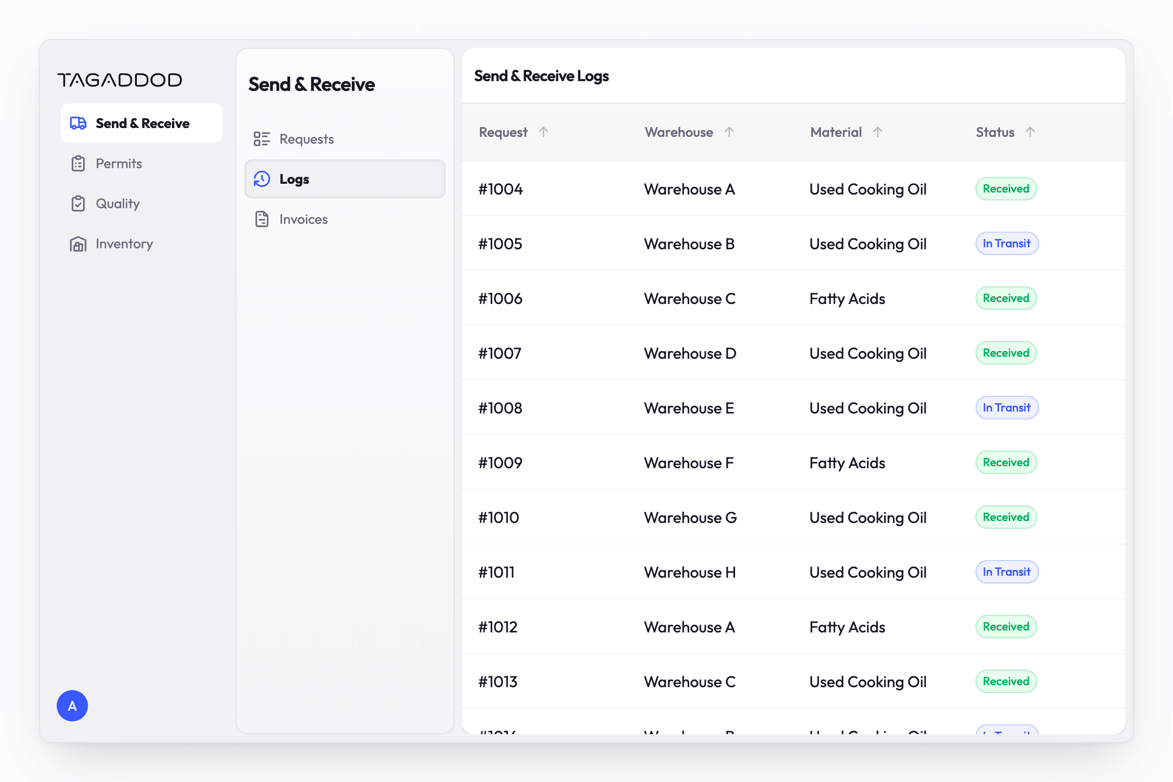
A reconstruction of the receiving screen, rebuilt from library components with made-up orders and weights, since the real one shows live records. The product itself runs on a copy of the library's tokens and rules, with components of its own.
Sitting next to people
The most useful week of the whole project was the one I spent sitting next to
people while they built, watching where they got stuck and fixing the rules that
had let them down.
Most of the people I wanted to reach were not developers, so the help could not
start at the design system. The documentation site grew a learning path that
starts at "What is AI?", walks through the tools, the setup, GitHub and MCPs,
and ends with building a prototype, adding a real backend and connecting to the
company's existing systems.
Three pages of the documentation site: colour, the button, and the start of the learning path.
My sessions followed the same order, starting with how to build a product from
nothing and leaving our button for much later.
The learning path drawn as a climb from the ground: a low first step, what AI is, then a flight of smaller steps through the tools, the setup, GitHub and MCPs, then three big steps up, building a prototype, adding a real backend, and connecting to the company's existing systems.
from nothingWhat is AI?The tools, the setup, GitHub and MCPsBuilding a prototypeAdding a real backendConnecting to the company's existing systems
It starts with what AI is, before any tool.
It changed habits. Product people shipped internal tools built on the system,
and prototypes that used to start in Figma started in code. Then it went
somewhere I had not planned. Before I left the company, the Chief Product
Officer asked me to run a session for product managers and engineers, so they
could keep building through the design system after I had gone.
Epilogue
Still open
How much designer does a product still need?
I would not call this finished. What an agent builds inside these rules still
needs a designer's pass to be right, and I keep working on that gap most days.
How much of a designer's judgement can be written down before what is left is
taste nobody can write? How small can that final pass get?
My answer so far: less than it used to, more than none.
Outcome
Design goes straight to code: consistent products and rapid prototypes ship without a Figma step
Product managers ship small internal tools fast, and they look like the rest of the product
I built the Warehouse Center on the system, and it became one of the products the operation runs on
House rules for agents, from component usage to layout defaults, behind one MCP server
A coded library for English and Arabic, grown out of the Figma system