3.6% more orders from a menu customers kept leaving
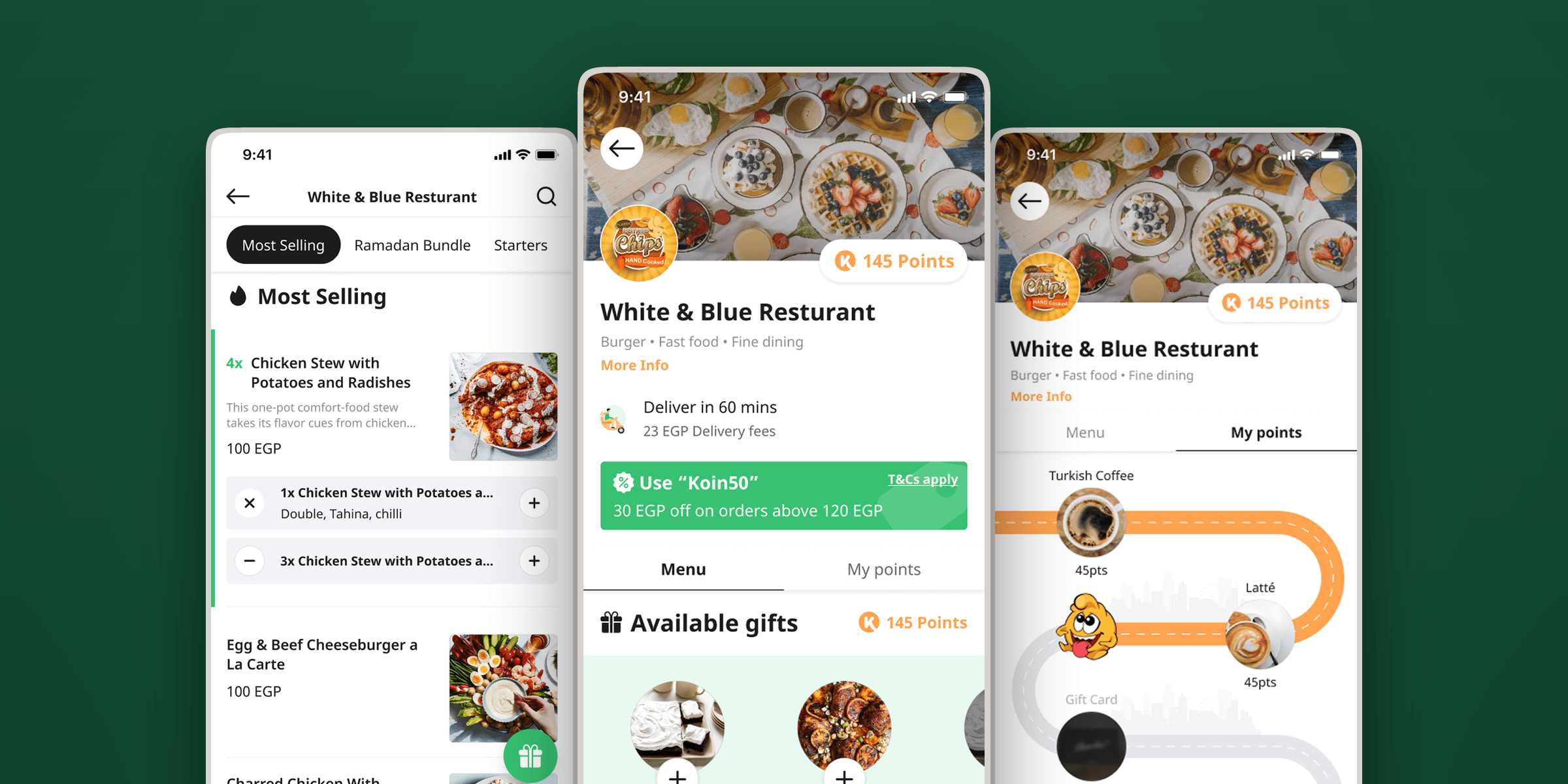
Session recordings showed customers leaving the menu mid-order, most likely to go back for a promo code. I redesigned the restaurant page so the code and the loyalty rewards sat inside the ordering flow.
Interaction designUX researchInformation architectureFigmaAmplitudeSmartlook9 min read
Outcome
3.6%
more customers went from the menu all the way to checkout
20s
off the median time from menu view to basket view
12%
more customers reached the basket from the menu
11.4%
more applied a promo code without leaving the menu
Recorded in the original project report from Amplitude funnel data after the first release.
In this article9
The problem · The evidence · The redesign · What it moved
Loading case study
Koinz began as a loyalty product. Customers visited a restaurant, earned
points, and later exchanged those points for a gift from the same brand. When
delivery and pickup were added in 2020, ordering was placed on top of that
model.
By 2021, one restaurant page was carrying both products. It needed to help a
customer choose food, configure an item, apply a promotion, and reach the
basket. At the same time, it needed to explain points, make available gifts
visible, and preserve the restaurant relationship Koinz promised its merchant
partners.
The existing page could not balance those jobs. It had become one of the biggest
drop-off points in the ordering funnel, and lifting that funnel was the goal of
the work: more customers going from the menu to a completed order.
I redesigned the restaurant menu around a clearer path to purchase without
reducing loyalty to a secondary badge. The work combined task analysis,
Smartlook session recordings, Amplitude funnel data, competitive analysis,
information architecture, prototyping, stakeholder reviews, and a second
Arabic-language iteration after launch.
Role
Product Designer
Duration
2021
Scope
Task and funnel analysis, Behaviour synthesis, Information architecture, Interface and interaction design, Interactive prototypes, Design handoff and iteration
Team
Worked with the Head of Product, Product Manager, and UX Designer
One restaurant page, with the order context, the promo code and the available gifts all sitting where the decision is made.
The menu inherited a loyalty product's structure
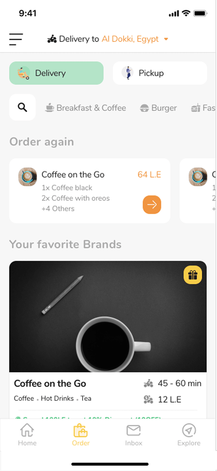
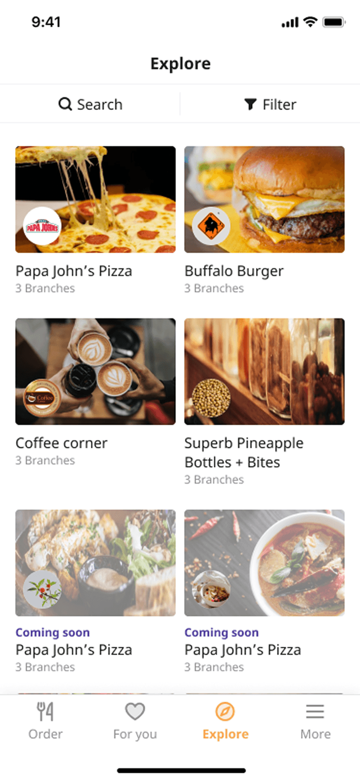
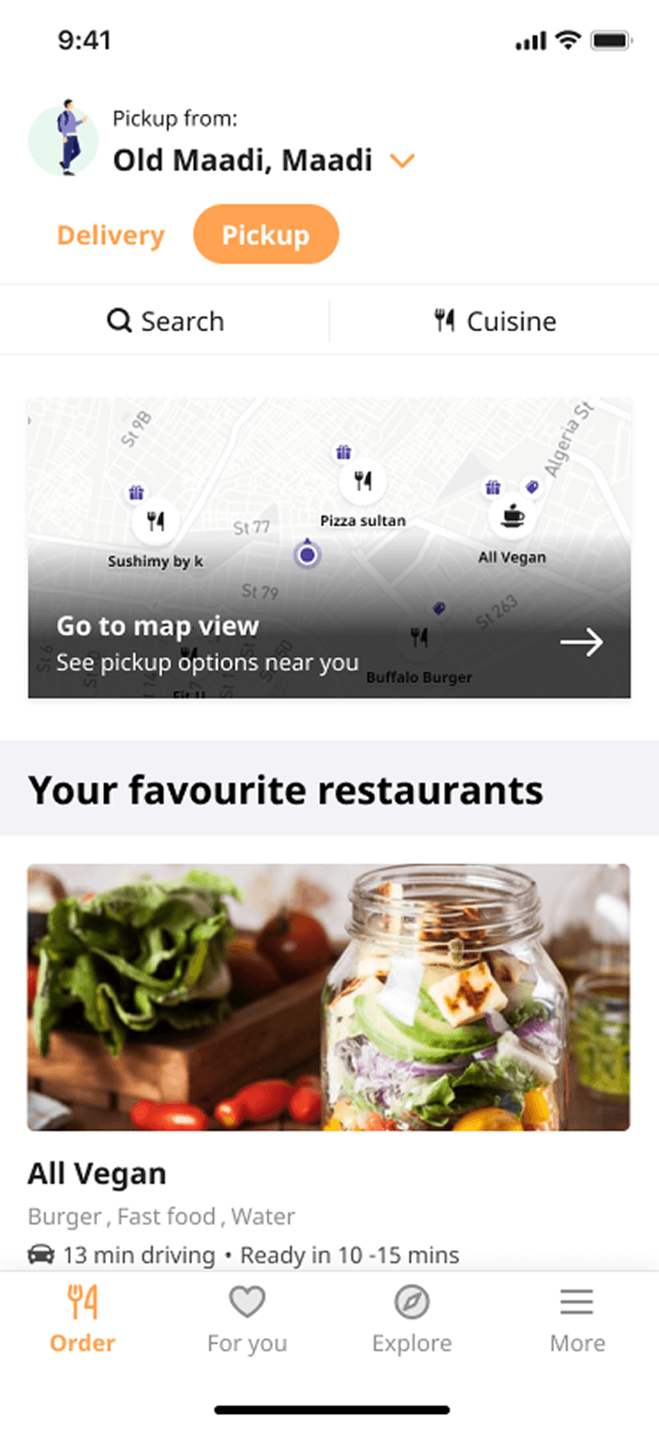
Koinz had three routes into a restaurant. The Order page helped customers find
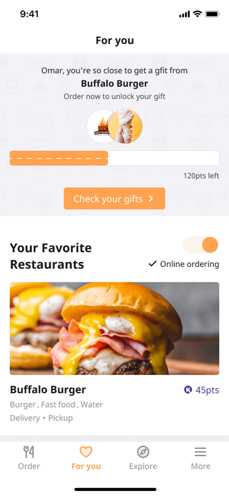
nearby restaurants for delivery or pickup. For You showed brands they had
already visited and where they held points. Explore was a wider restaurant
directory inherited from the earlier product.
Those entry points led to different places. Entering from Order
opened the food menu. Entering from For You or Explore opened the points
section. Two customers could tap the same restaurant and arrive at different
interfaces because of where they started.
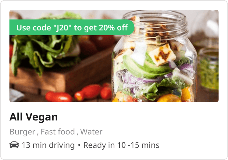
Order was one of three routes into a restaurant, and the only one that opened the food menu.
For You opened the same restaurant on its points section instead, so the same tap led somewhere else.
Explore was the third route in, a directory inherited from the loyalty product that came before ordering.
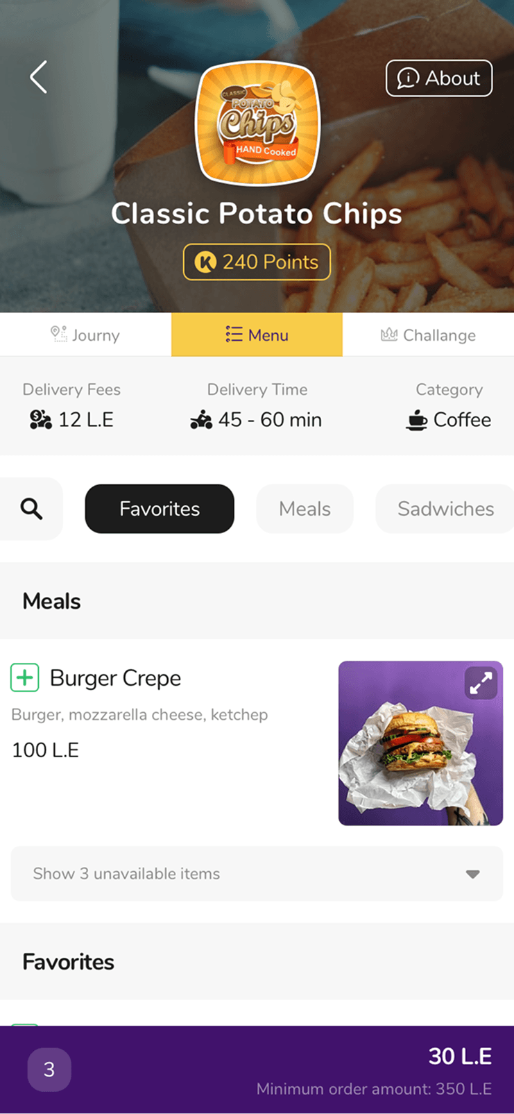
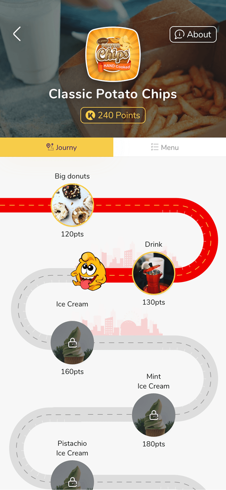
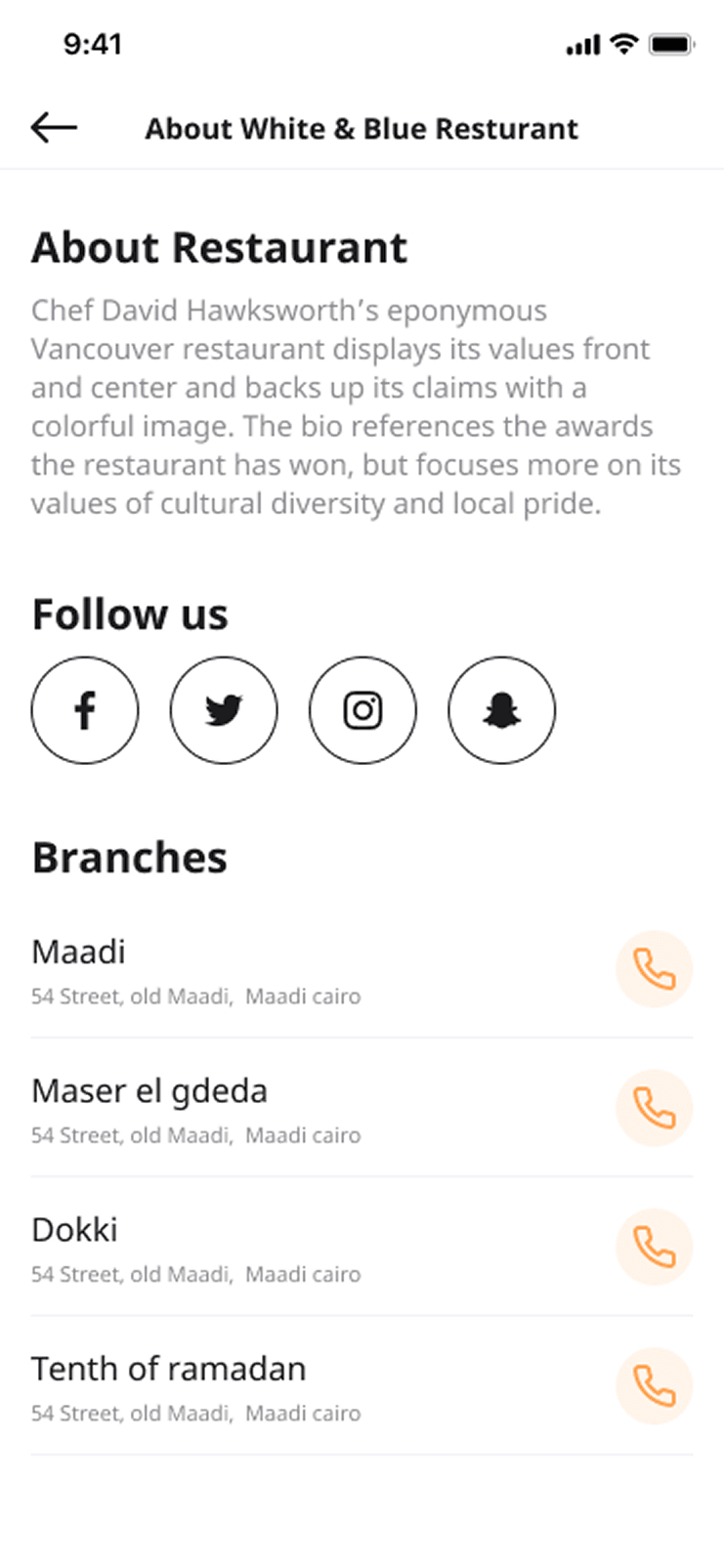
The restaurant page itself was also split between two distinct sections:
a conventional food menu; and
a visual gift map showing the customer's points and what they could redeem.
The Menu tab: a conventional food menu, with delivery fees, delivery time and category above search, categories and the item list.
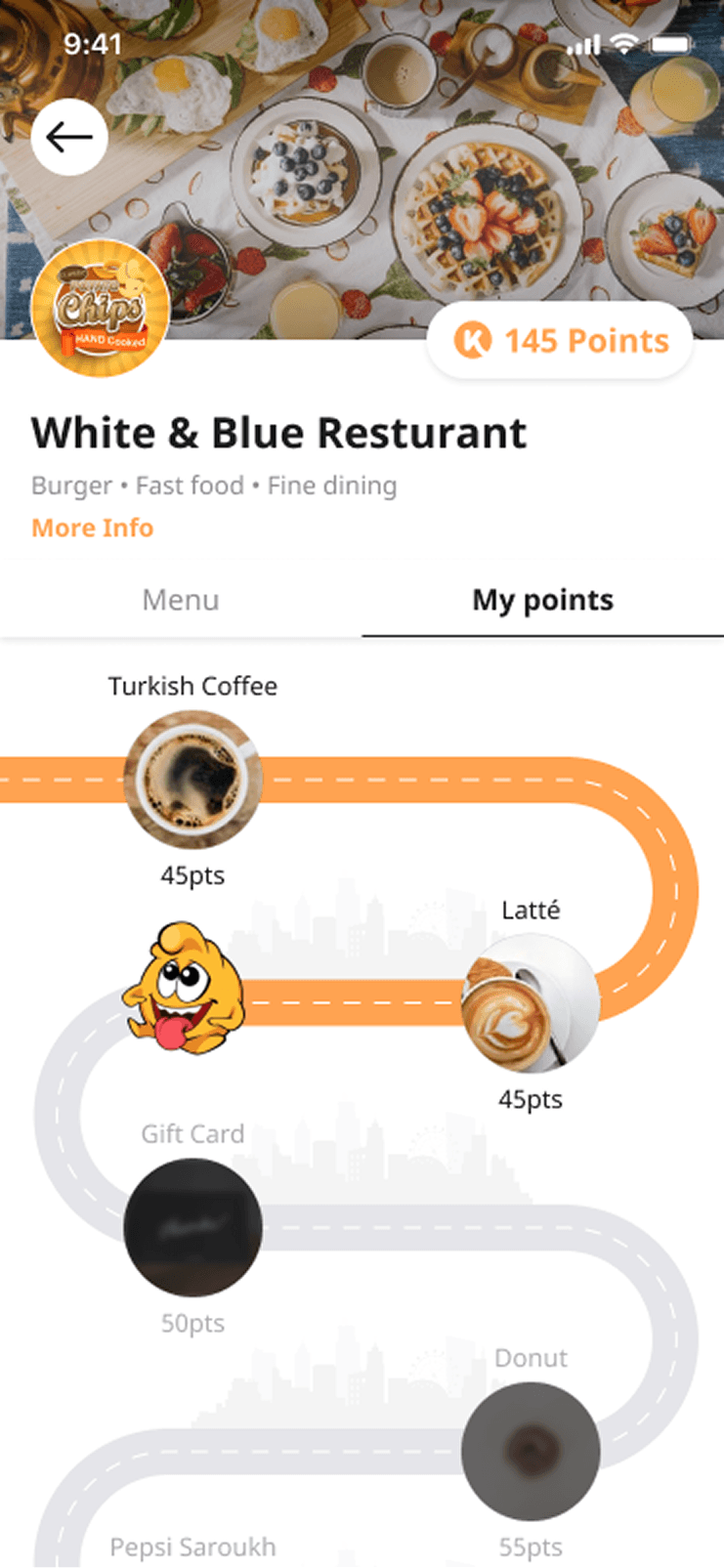
The Journy tab: the same restaurant as a road of gifts priced in points, most of them still locked.
The split reflected the company's history, but it made the current product
harder to understand. Customers could lose track of whether they were ordering
for delivery or pickup. Some did not realise that gifts could be redeemed at
all. Search could fail when they were trying to find an item. The interface was
asking them to understand how Koinz had evolved before they could complete a
familiar ordering task.
OrderFor YouExplorethe seams
Product structure
Order opened the food menu. For You and Explore opened the gift map.
The entry point decided whether a restaurant opened as a menu or a points journey, and the seams between the loyalty and ordering products showed.
OrderFor YouExplore
Customer intention
Every route arrives at the same page. Menu and My points stay distinct views of it.
The restaurant became one coherent destination where customers could understand the order context, browse food, use a promotion, redeem a gift, and continue to the basket.
Both models stayed, behind one door instead of two.
The business constraint was part of the design problem
A conventional delivery-app redesign could have pushed rewards out of the way
and concentrated only on food. That would have simplified the screen, but it
would have weakened the reason Koinz existed.
Loyalty was one of the product's promises to restaurants. Merchants joined
because Koinz could help customers return to their brand. If the
new menu erased the restaurant's identity or made gift redemption invisible,
it might improve one funnel step while damaging the merchant proposition.
So the redesign had to pass two tests: more customers had to complete an order,
and the loyalty relationship had to stay clear to both customers and merchants.
The recordings showed why customers left
I started by mapping the task from restaurant entry to checkout, then examined
the Amplitude events around the critical section of the journey:
viewed the restaurant menu;
viewed a menu item;
added a menu item or gift;
viewed the basket; and
continued through checkout.
This made the loss of progression visible, but an event sequence could not
explain the customer's hesitation. For that, I used the product team's
bi-weekly Smartlook reviews and session recordings.
One repeated behaviour stood out. Customers would open a restaurant, add
items, and then return to the previous page, often the Order page, before
continuing. The likeliest reason was the promotional code. It appeared on the
restaurant card outside the menu, so customers were going back to retrieve
information they still needed inside the menu.
The promo code had become a memory test. A customer had to notice it, remember
it, enter the restaurant, choose items, and recall the code later. The product
had put a detour inside its own funnel.
The Order page, drawn as a street of restaurant cards, one of them carrying the promotion. A path runs from that card into its restaurant, past the menu to the basket, in five numbered steps: notice it, remember it, enter the restaurant, choose items, recall the code. From the basket a loop runs back out over the roof to the card and in again, lettered a detour.
a detour12345Notice itRemember itEnter the restaurantChoose itemsRecall the codeOrder page
A promotion the customer had to carry in their head from one page to the next.
Restaurant cards lived one screen before the menu, on the page the customer had already left.
The promo code was printed here and nowhere inside the menu. Customers either memorised it on the way past or went back for it, which is the detour the recordings kept showing.
Market patterns established the expected floor
I compared the restaurant menus in Uber Eats, Deliveroo, Talabat, and Elmenus.
Food ordering is a familiar pattern, and the comparison helped separate the
conventions customers already expected from what only Koinz offered.
Across the products, promotions were visible inside the ordering journey.
Restaurant ratings, pickup context, featured items, and ways to reach menu
items without excessive scrolling were common enough to be treated as a
baseline. Koinz had to meet it, then add its rewards in a way a generic
delivery app could not.
A floor across the drawing with five things standing on it, what the menus compared had in common: promotions inside the ordering journey, restaurant ratings, pickup context, featured items, and ways to reach menu items without excessive scrolling. Above them, on columns of its own, stands a storey holding a road of gifts and a jar of points, labelled integrating rewards. The floor is lettered the floor.
the floorIntegrating rewardsPromotions inside the ordering journeyRestaurant ratingsPickup contextFeatured itemsWays to reach menu items without excessive scrolling
The menus compared set the floor to meet. Rewards were Koinz's storey above it.
Everything so far pointed to three principles:
reduce the time and effort required to decide what to order;
keep order method, timing, fees, and restaurant information visible; and
surface promotions and gifts at the moment they can influence a decision.
I reorganised the page around progression
In the new information architecture, the two products joined at the top became
one destination.
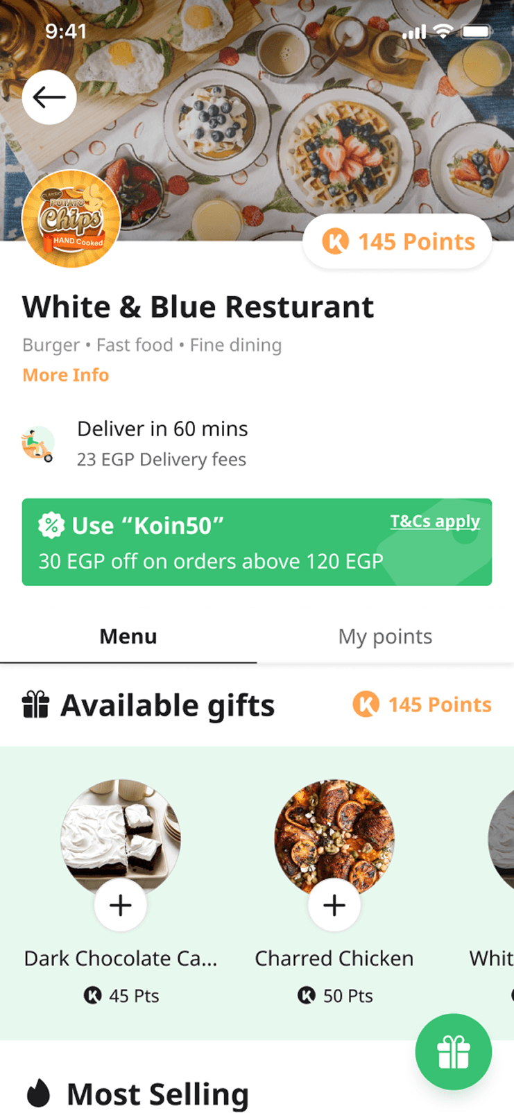
The page opened with the restaurant identity and the practical context of the
order: delivery or pickup, expected time, fees, and access to more information.
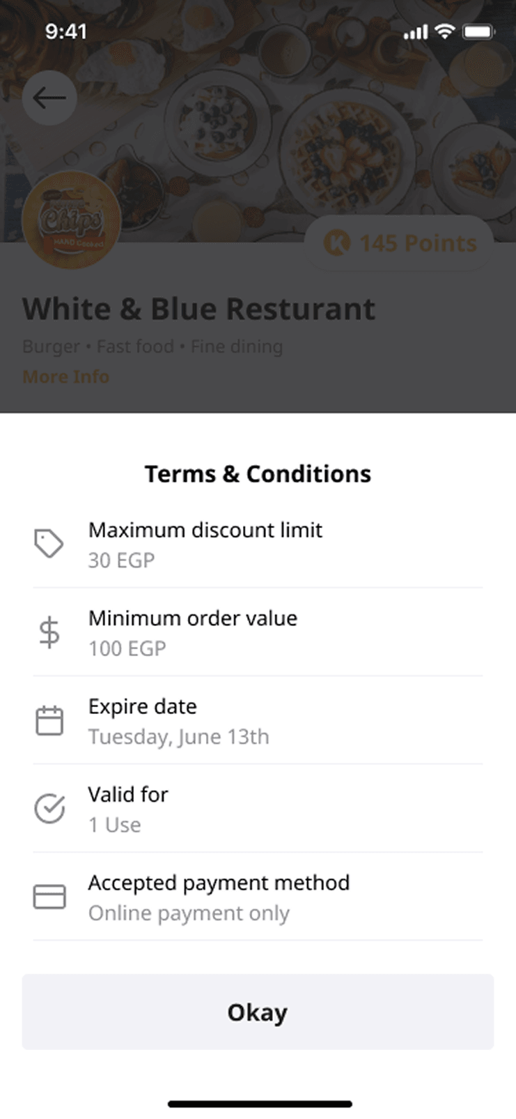
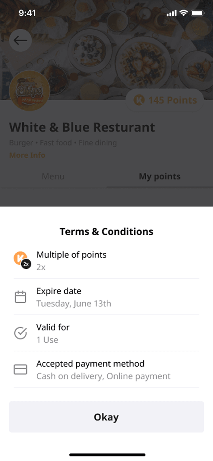
The available promotion moved into the page itself. Menu and points remained distinct views, but they now belonged to
the same structure and no longer depended on a hidden entry-point rule.
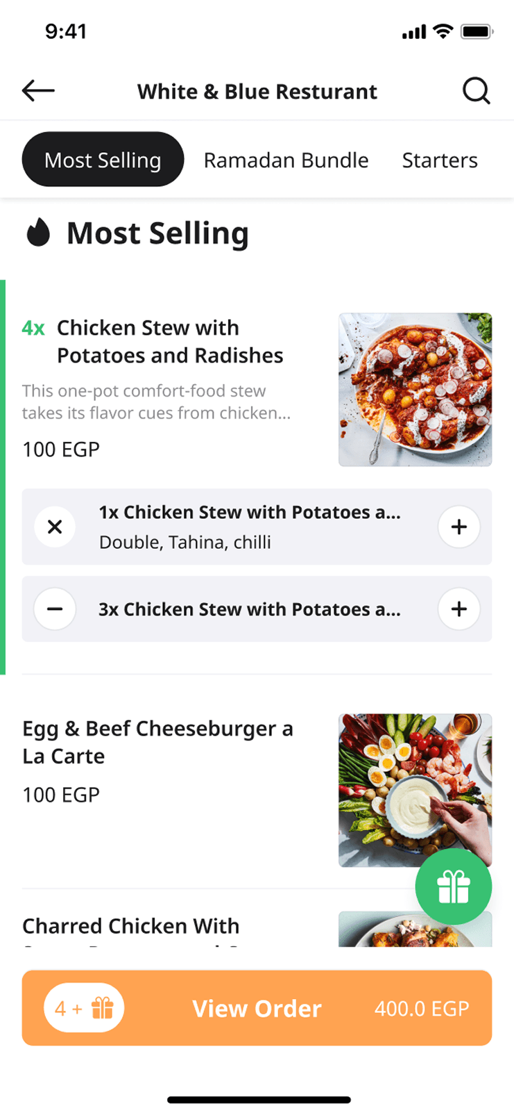
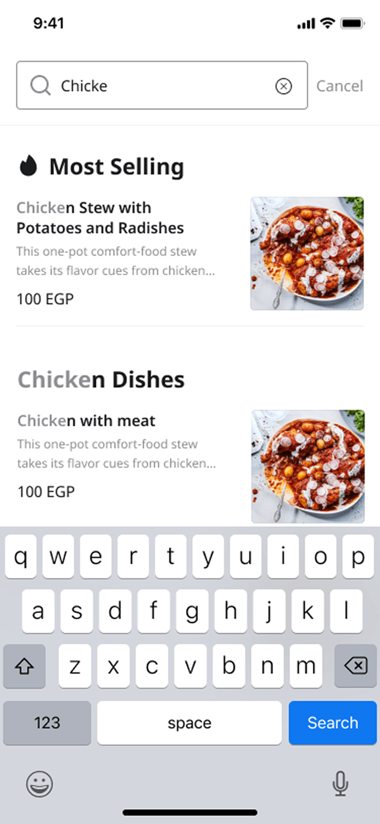
Inside the menu, highlighted categories such as Most Selling shortened the
path for customers who did not arrive with a specific dish in mind. Category
navigation and restaurant-level search supported customers who did. Available
gifts appeared beside the food, where first-time customers would see them.
The basket action stayed visible as items were added, giving the customer a
continuous sense of progress and a direct next step.
one destination
01
Restaurant context
Where and how the order will happen
Brand details
Delivery or pickup
Time and fees
Restaurant information
02
Immediate value
What the customer can use now
Available promo code
Points balance
Available gifts
03
Browse
How the customer reaches a decision
Most selling
Categories
Search
Menu items
04
Configure
What belongs to one item
Photo and description
Required modifiers
Optional extras
Quantity
Note
05
Progress
How the customer completes the task
Add to basket
Persistent order summary
Basket
Checkout
The architecture keeps the order context and the loyalty value in view from restaurant entry to checkout.
Decision
Keep menu and points distinct, but make them one experience
Chose
Use one restaurant page with clear Menu and My points views, then surface the most relevant promotion and available gifts inside the ordering context.
Trade-off
A completely merged feed might have appeared simpler, but it would mix food, gifts, and point progression into one long list. Separate views preserved clarity while the shared page removed the old entry-point inconsistency.
This also protected the merchant relationship. Restaurant identity remained
prominent, and Koinz's loyalty layer became useful at the moment of choice.
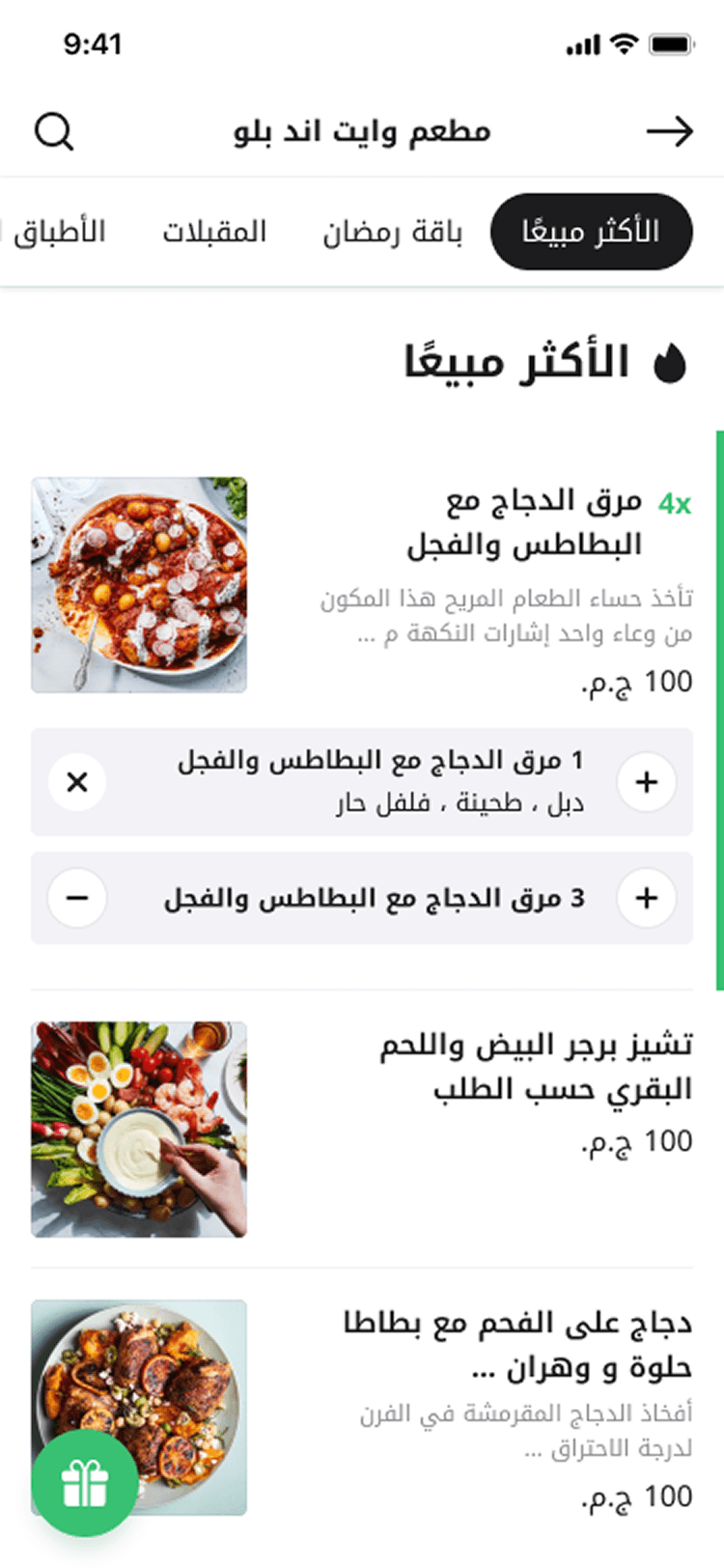
The menu opened on Most Selling, with the order bar keeping the next step in view.
Points kept a view of their own, now inside the same page.
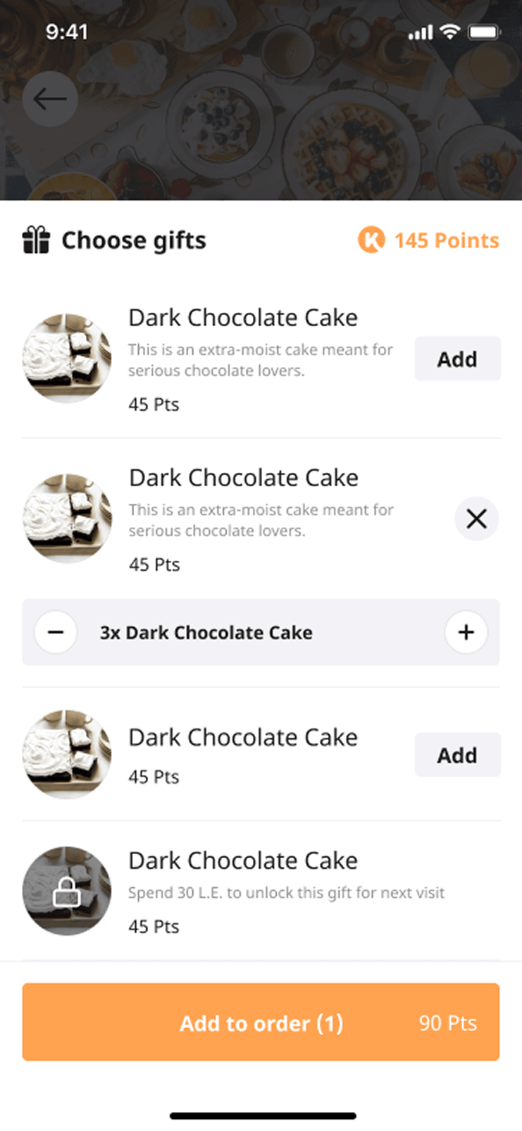
Redeeming a gift became part of building the order.
Restaurant identity kept a place of its own. Koinz sold merchants a relationship with their customers, so the redesign could not flatten every brand into one marketplace template.
The rules that decide whether a code will apply, shown before the customer builds an order around it.
The same treatment for the loyalty offer, so points are as legible as the discount sitting above them.
Choosing and configuring an item became one continuous task
The old experience made the menu feel like a catalogue with a loyalty product
attached. The redesigned item flow made each step answer the next customer
question.
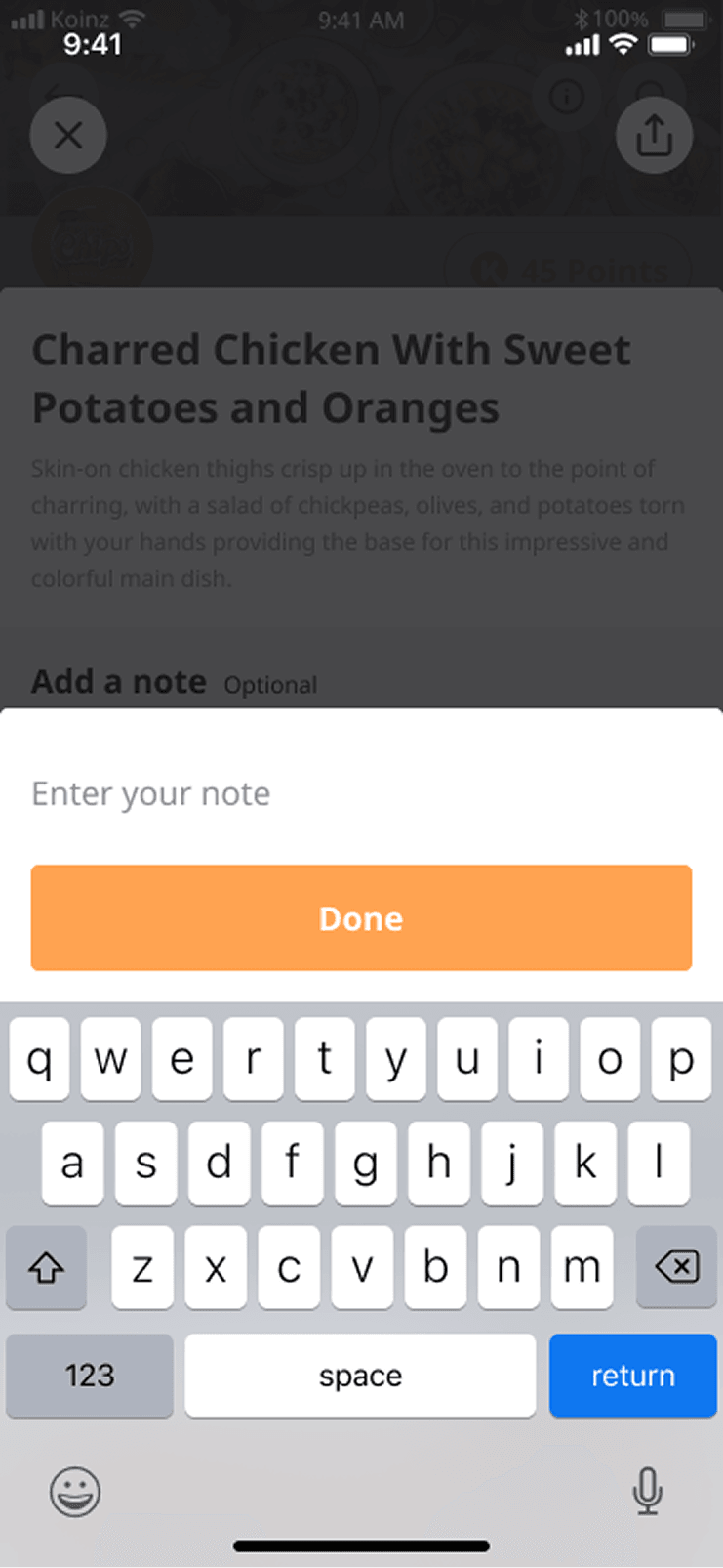
The menu list showed imagery, item name, supporting description, and price,
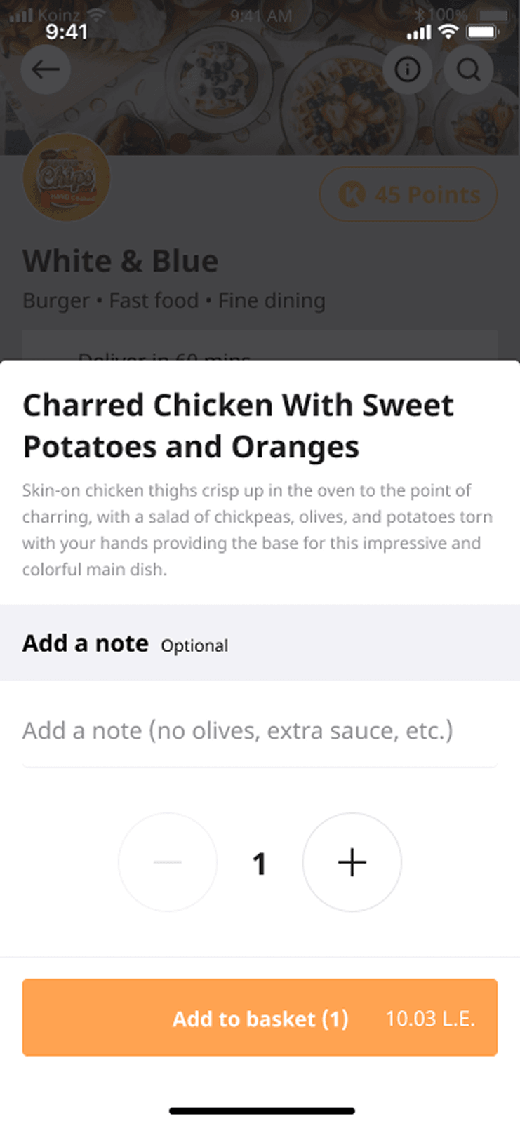
with a visible add action and quantity controls. Opening an item moved into a
focused configuration view: a larger image and description established what
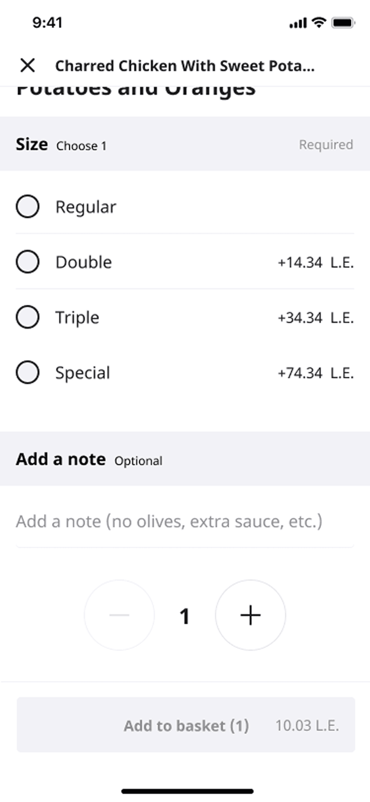
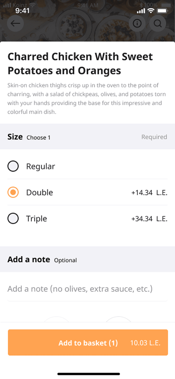
the dish was; required choices and optional extras were separated; price
changes stayed attached to the relevant option; quantity and notes followed;
and the final basket action showed the resulting total.
I prototyped the behaviours that static screens could not settle on their own:
customers entering without an order method, adding a gift, conditional
modifiers, modifier counts, notes, and promotions tied to online payment. This
made the handoff about states and rules as well as layouts.
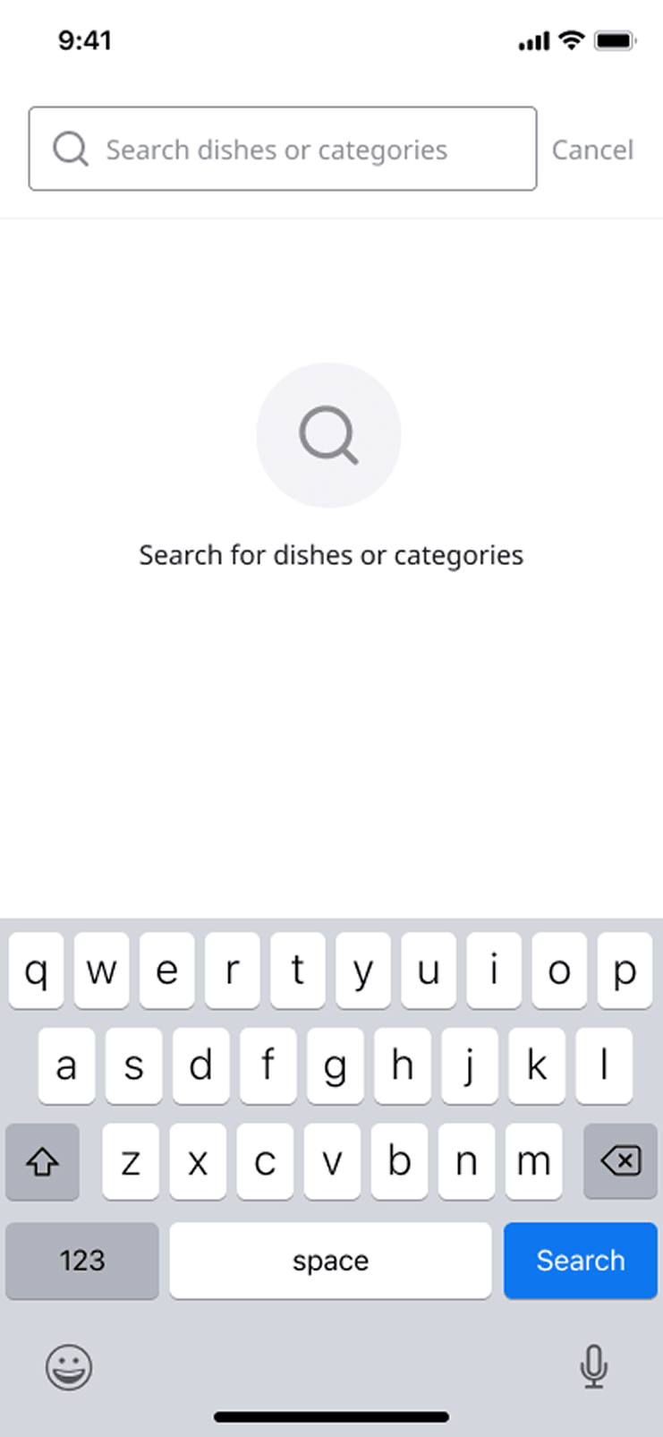
Search was also moved into the restaurant context. Customers could search
dishes or categories without returning to the marketplace, and results stayed
grouped in the same menu structure they already understood.
Search moved into the restaurant, so looking for a dish no longer meant leaving for the marketplace.
Results, grouped the way the menu is.
An item opens over the menu, so the customer keeps their place in the list.
Required choices come first, and the price change stays attached to the option causing it. The button stays disabled until the choice is answered.
The moment the required choice is made, the next step becomes available and shows what it will cost.
Notes, conditional modifiers and gift additions were states a static screen could not settle, so they were prototyped.
More customers reached checkout, and they got there faster
The goal was the ordering funnel, so two results in the original project
report matter most. Conversion from the menu all the way to checkout increased
by 3.6%, and the median time from menu view to basket view fell by
20 seconds.
Every step in between moved in the same direction:
menu view to basket view conversion increased by 12%;
menu-item viewing increased by 7.3%; and
adding a menu item increased by 3.4%.
Applying a promo code after entering the menu increased by 11.4%. During
this phase the business was focused on GMV, and the conversation inside the
team was about order ticket size per customer. A promotion only serves that
goal if customers use it, and the old page made them leave the menu to find
one. Moving the code into the page removed the detour the recordings kept
showing, so the promotion could push customers towards a bigger order.
Read together, the numbers say customers hesitated less over what to order and
left the menu less often to find what they needed.
The five steps of the funnel, left to right: viewed the menu, viewed an item, added an item or gift, viewed the basket, went through checkout. Measured from the menu, conversion to the basket increased by 12% and conversion all the way to checkout by 3.6%. Menu-item viewing increased by 7.3% and adding a menu item by 3.4%. The median time from the menu to the basket fell by 20 seconds, and applying a code without leaving the menu increased by 11.4%. Lettered: the same direction.
+7.3%+3.4%+11.4% applied a code without leaving the menuViewed the menuViewed an itemAdded an item or giftViewed the basketWent through checkoutmedian time from menu to basketthe same direction
The first release, measured along the funnel, from the original project report's Amplitude data.
The second iteration found a problem hidden by the first
The first release lifted the funnel, but it did not end the work. More than
60% of Koinz customers used the app in Arabic, and the Arabic typeface in the
menu was not readable enough. A design that worked structurally was still
creating friction for the majority language.
I made a focused second iteration to improve the Arabic menu's readability and
hierarchy. The original report recorded an average 5% increase from menu
view to basket view and a further 7.3% increase in menu-item viewing after
that work.
This iteration changed how I understood the first result. Typography, density,
scanning order, and right-to-left composition were part of the conversion
experience itself.
The same dish row drawn twice, mirrored about a centre line. In English the name, description and price hang from the left edge with the photograph on the right, and a line reads left to right. In Arabic the row is mirrored: the photograph on the left, the text hung from the right edge, read right to left. A revision cloud numbered 2 surrounds the Arabic name, description and price, the part of the row the second iteration revised.
right to leftIn EnglishIn Arabic
One dish row in English, and mirrored in Arabic. The cloud marks the part the second iteration revised.
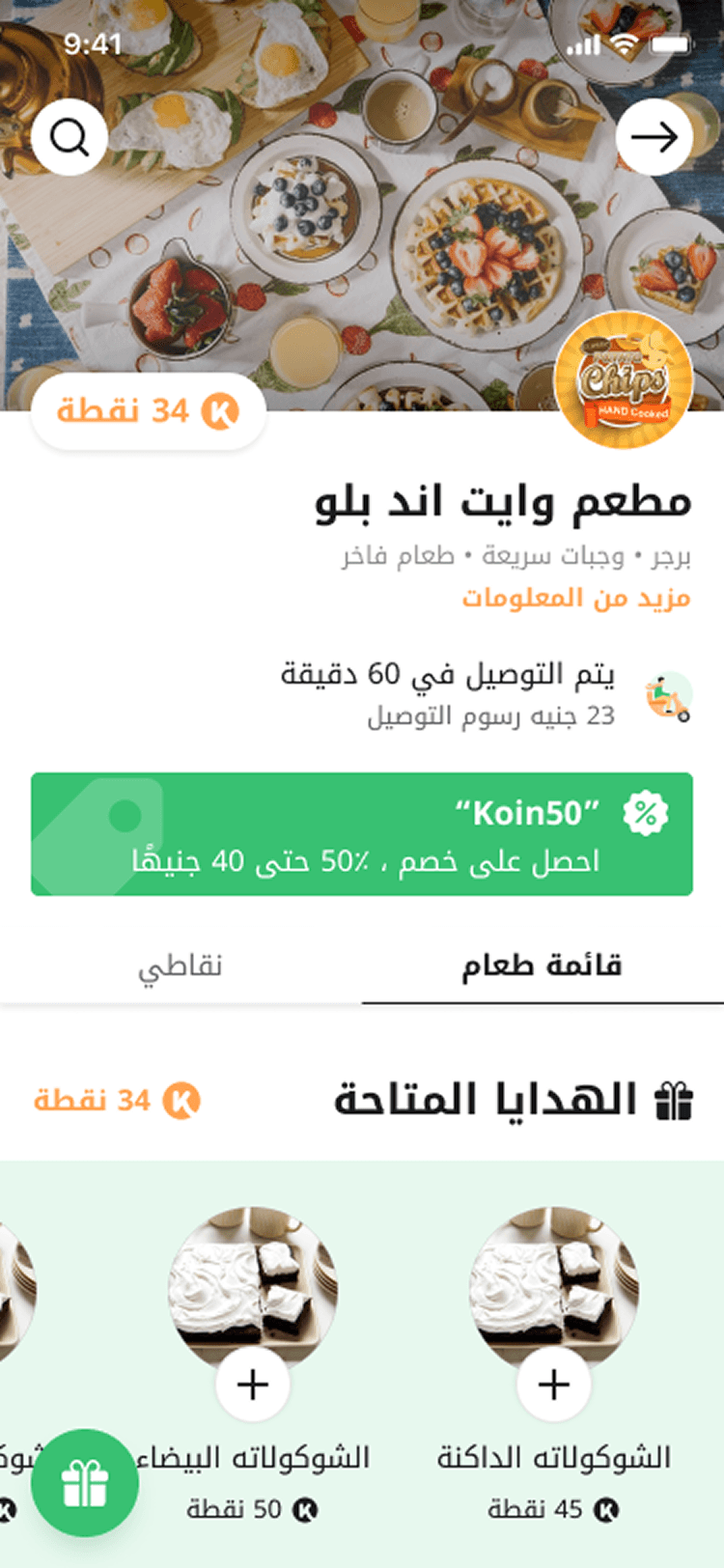
The same page in Arabic. Every relationship the English page sets up reads in the opposite direction, so the order of the tabs, the balance and the promotion had to be laid out again for right to left.
More than half of Koinz customers read the app in Arabic. The second iteration was about this screen: the typeface, the size of a dish name against its description, and how far the eye travels from the name to the price.
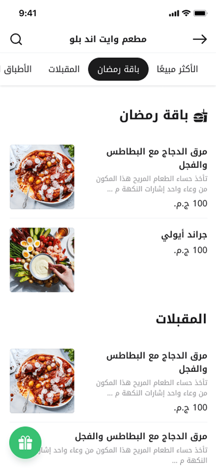
Category navigation carried over intact, with the same sections the English menu offers.
What I would strengthen in a new measurement cycle
The project connected observable behaviour to interface changes, but I would
make the attribution more rigorous today.
I would document the exact baseline and post-release windows, segment the
funnel by language and order method, and separate first-time customers from
people who already understood the loyalty model. I would also test the three
entry points together, since the redesign left their overlap for later. It made
the restaurant page coherent, and a later phase should do the same for the
routes into it.
The menu was where a marketplace ordering pattern, a restaurant's identity, and
Koinz's loyalty model met. The redesign worked because it put all three on one
page and made them work together.