A design system is a set of decisions, and the code is where they live
- Written by
- Ahmed Amr
- Published
Part 1 of 13 in Build a design system with a coding agent.
In this article10
Why a system · Why the code · The series
Loading article
Part 1 of 13 in Build a design system with a coding agent.
Why a system · Why the code · The series
Every product makes thousands of small decisions about how it looks. Which blue the main button is, how round its corners are, how much room sits between a label and its field, and what happens to all of it in dark mode or in Arabic. A design system is where those decisions get made once and kept. This series shows a designer how to build one in code with a coding agent, and how to get a team using it. This first part is about why it is worth building, and why the code is the part a designer should understand.
A product without a system still has decisions in it. They get made one screen at a time, by whoever builds that screen, from whatever they can see. A designer picks a blue in a mockup. A developer samples something close to it from a screenshot. Six months later someone builds a new screen by copying an older one and nudges the blue because it looked flat on their monitor. Every choice is reasonable, and every one is a little different.
#2f72d66px corners, 38px tall
#1f62bd10px corners, 44px tall
#3b80e34px corners, 36px tall3.9:1 with white, under 4.5:1
#2a5fae8px corners, 40px tall
#3470c912px corners, 42px tall
Side by side, the drift is easy to see. One screen at a time, nobody notices it. That is how a few years of reasonable choices leave a product with a drawer full of blues and nobody able to say which one is right. In the figure, the lightest blue has also stopped passing contrast with its white label. Nobody decided that either. It came with a blue someone picked by eye.
A design system makes each of those decisions once, in one place, and every screen reads it from there. In the second state of the figure, five screens ask for color.fill.brand and get the same answer. Change the answer and all five change. A new screen starts from parts that already agree with each other, so it is quicker to build and looks like it belongs.
Tokens are decisions about values. The blue is a A design decision with a name, such as a colour, a size or a font, stored once so design and code read the same value., the 8 pixel corner is a token, and so is the space between a label and its field. Each one has a name that says its job, color.fill.brand and not #226ec5, so a screen asks for the job and the system supplies the value.
Components are decisions about parts. A button that already knows its colours, its corners, its hover and its focus ring is a decision nobody has to make again on the next screen.
Rules are decisions in words. When to use the main button and when the quiet one, what a screen must never do, what name a new token gets. A team reads them in documentation, and an agent reads them in a rules file before it writes anything.
In Figma the first two are variables and components. The third usually lives on a documentation page, where it depends on someone remembering to look, and part of this series is about moving those rules to where an agent reads them every time.
A single product with one team can get by on care and memory for a while. A system starts paying when something multiplies. Two brands share one set of components. A web app and a phone app should feel like the same product. Three teams build screens at the same time. An agency builds the same kind of product for a new client every few months. A product ships in English and Arabic, and every screen has to work right to left as well as left to right.
Each of those multiplies every decision by the number of copies. Without a system, a rebrand is a search through every screen of every product. With one, it is a file. The series ends up there, with several brands, light and dark, English and Arabic and two platforms sharing one set of decisions.
A mockup is a picture of the product at one moment, usually its best one. The main button sits in its default state with a label that fits. Once the product ships, that button meets many more situations, and each one needs an answer.
What the mockup showed
DefaultThe one state everyone agreed on.
What the code had to decide anyway
HoverWhich fill when the pointer is over it?
PressedDarker again, or a little smaller?
Focused from the keyboardWhat ring, in what colour, how far out?
DisabledFaded, or a fill of its own that can still be read?
LoadingA spinner, and words a screen reader can announce.
A long labelWrap to a second line, or cut it short?
ArabicAnother family, and the arrow on the other side, pointing the other way.
DarkWhich blue, and which label, on a dark surface?
Whatever the designer leaves undecided, whoever builds it decides, and theirs is the version users see. Usually it happens late, under a deadline, by copying something nearby. The hover colour gets darkened by eye, the focus ring gets left out because nobody tabbed through the mockup, and the Arabic version gets the English layout with the words swapped in.
A designer who knows how the code is organised can make those decisions where they live. You can ask for the hover colour as a token instead of a hex value. You can see that a screen uses a copy of the brand blue instead of the token, and know that the copy will not follow the next rebrand. With a coding agent, you can make the change yourself, run the check and open the pull request.
None of this asks a designer to become a developer. It asks for three things. Where each decision lives, meaning which file and which name. What points at what, so a change in one place is understood before it is made. And how to check, so the agent's work can be trusted without reading every line of it.
The agent writes the code. You decide what it says, read its explanation back, and stop it when the explanation is wrong. Every prompt in this series asks the agent to explain each file it writes in two sentences a designer would follow, and reading those explanations is most of the job.
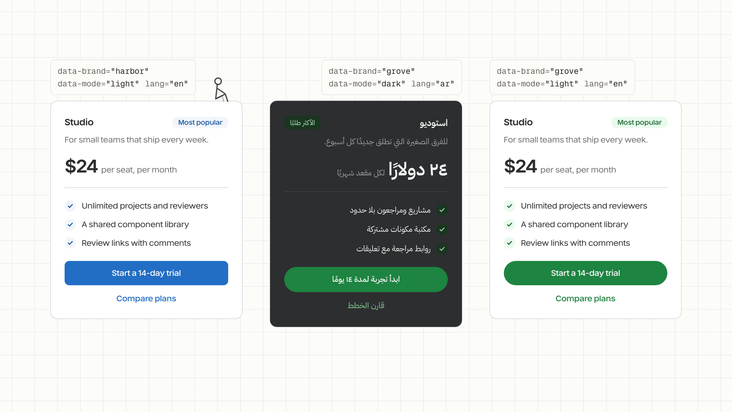
The token parts of the series end with one pricing card and three switches. Each switch is one attribute on the page and one file in the repository, and the card itself never names a colour or a side.
On the element
<divdata-brand="harbor"data-mode="light"lang="en"dir="ltr">
Harbor, light, English.
The files they pick, on top of the shared tokens
tokens/brands/harbor.jsonSwitch it to Arabic and the card turns right to left. The tag moves to the other corner, the check marks move to the other end of each line, and the type changes family. Nothing in the card's styles mentions left or right, so none of that needed a second version of the card. Part five shows how to build that way from the first component, which costs far less than adding right to left to a finished library.
The series is long because a system is more than its tokens. Each part ends with something working, and each can be read on its own once the first two are done.
| Part | What it builds |
|---|---|
| 1. Why a design system, and why in code | This page. |
| 2. Set up the repository and its switches | The folders, GitHub, a check on every change, and the first rules for the agent. |
| 3. Design tokens in layers | Primitives, semantics, the first brands, and a component layer only where a brand needs one. |
| 4. Dark mode and many brands | Every brand in light and dark, contrast checked for every pair, white label and an agency's clients. |
| 5. Right to left, and every language | Arabic type as a switch, layouts that mirror by themselves, icons, numbers and dates, and testing both directions. |
| 6. The tokens after colour | Status colours, states, type, spacing, shadows, motion and stacking order. |
| 7. Naming, versions and shipping tokens | Names an agent follows, safe renames, releases, other platforms, no theme flash, screenshot tests. |
| 8. Components for the web | A component library on a headless base, and accessible components built from scratch. |
| 9. From components to screens | Layout, page shells, navigation and forms, so screens come out consistent. |
| 10. Components for mobile, in React Native | The same system in a phone app, with native accessibility and right to left. |
| 11. Documentation people and agents can read | A docs site with live examples, written so an agent can read it too. |
| 12. Teaching agents to build with the system | Rules, skills and a server that hands an agent the system's real parts. |
| 13. Shipping it, adopting it and keeping it alive | Packages, moving existing products onto it, keeping design and code in step. |
The series works the same way throughout. The agent gets one job per prompt, written out in full on the page so you can copy it. It explains every file it writes, which is how you stay the one making the decisions. Under each prompt, a replay plays what the agent did, beside a picture of what it made.
Every decision the series makes also becomes a rule the agent reads before it works and a check that fails when the rule is broken. Rules alone get forgotten, by people and by agents. A rule with a check behind it holds.
The replays are scripted from the real sessions that built the starter repository, trimmed to fit, and they name no particular coding tool. Any agent that can work in a folder of files and run commands will do the same job.
A computer with Node.js 22 or later and Git, a code editor, a coding agent that works in a folder and runs commands, and a free GitHub account. Part two shows where to get each one. You will open a terminal, and every command the series uses is explained when it first appears. No coding experience is assumed. Some familiarity with design tool variables and components helps, and where it does, each part shows what the code it just built corresponds to in Figma.
Most teams do not start from nothing. They have a product with several blues already in it. The series works for that case too, with one step added before each build. Before part three, collect the colours, type sizes and spacing values the product already uses, and the primitives come from that list instead of from scratch. Before part eight, screenshot every screen and let the agent list the components it can see, and the build order comes from that inventory. Part three says how to start the primitives from the values you collected, and part eight includes the prompt for the inventory.
Part two sets up the repository the rest of the series builds in, starting with the switches it will need.